
Bobby Abley


output One - Logo
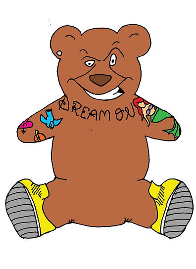
G Bear - final digital version
development of the Logo
Stage Two -
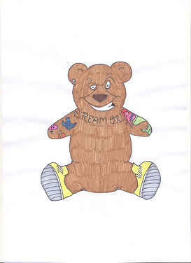
Pencil Colour
This was the first development of the originial sketch. By adding colour we could start playing with ideas of how he would look visually.
Stage Three -
Pen Colour
Using bolder colours we were able to begin considering how we wanted G-Bear to look digitally. This then lead to scanning in the original sketch and digitally adding colour using Photoshop.
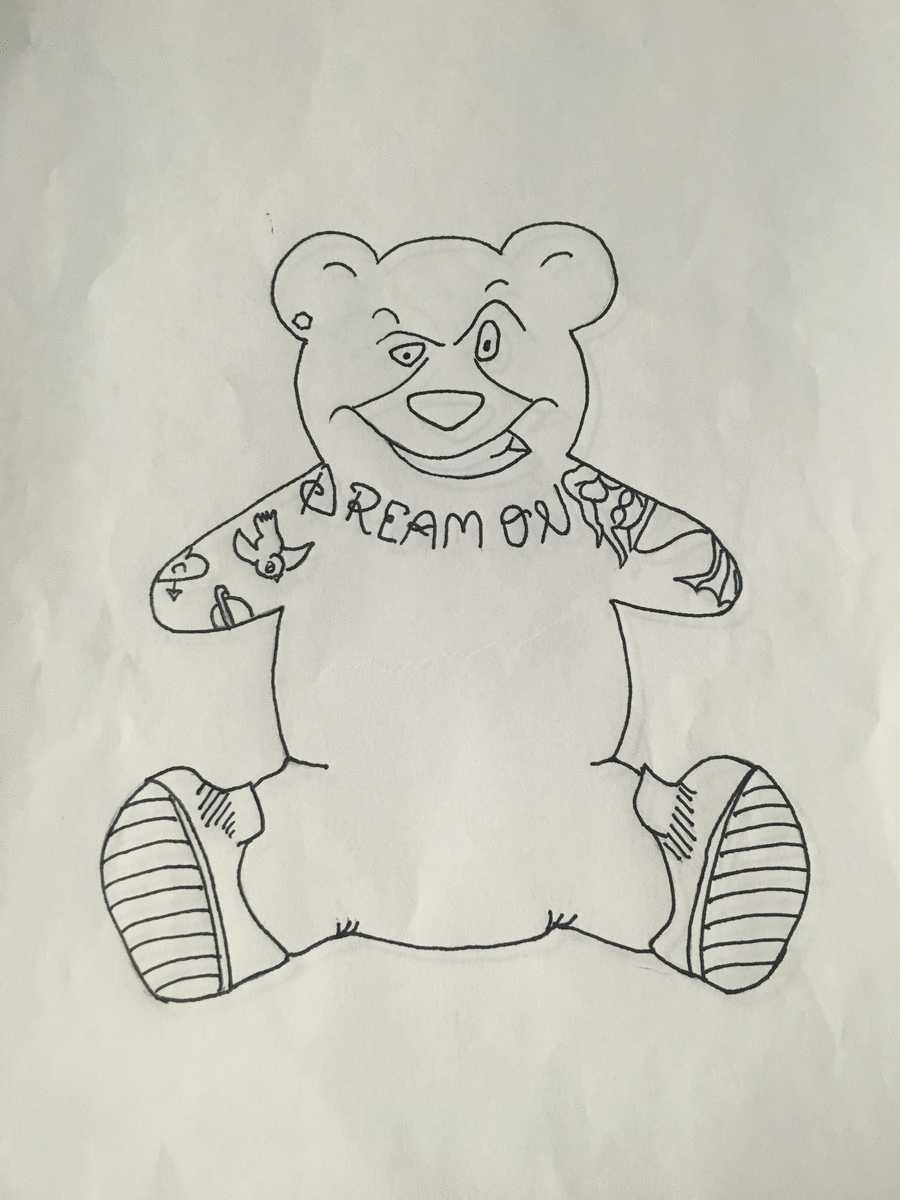
Stage One -
This is the original sketch of the logo, named G-Bear, and from this we could develop the concept further in terms of colour.
Bobby Abley's current logo is a sillhouette of a Bear, however we decided to give the bear a persona by keeping the original shape but adding characteristics.
G-Bear was given a mennacing grin to reflect his side kick status in the comic strips, and the tattoos G-Bear has been given are copies of ones seen on Bobby Abley himself.


Re designing the Bobby Abley mascot, focusing cohorenetly on bringing the bear to life but also staying true to Bobby's original logo design. The silhouette remains the same shape, but emulating Bobby himself through his tattoos. The bear being brought to life comprehensively communicates the campaign, giving the online communication an enhanced logo that is interactive and significant.
Stage 4
Exploring moving graphics encouraged us to play around with what we could do to give our logo some life, playing around with different images and speed. As seen in the above GIF the speed was too fast and the images didnt quite line up to make a smooth graphic.
Stage 5
In this graphic the speed is slower and the image is more realistic. This can now be used digitally as the re branded logo to communicate Bobby Abley's campaign. The moving alternative to the static image allows the logo to be appropriately used on all different platforms e.g Social Media, website etc.